

Schneps Media
Schneps Media publishes New York's biggest stable of community news brands, and growth by acquisition had left its websites uneven. We designed one reader experience across its key properties, and it still fronts Brooklyn Paper and New York Family today.
A multi-property UI/UX engagement that gave Schneps Media a consistent, mobile-first reader experience across Brooklyn Paper, New York Family and Star Network, built to carry the advertising that pays for the journalism.
What we were solving
Schneps Media is the dominant local publisher in New York. Its stable includes two metro dailies, 33 newspapers, 28 magazines, 20 websites and more than 50 annual events, from Queens (QNS) and Manhattan (amNY) to Brooklyn Paper, the tabloid-spirited weekly covering North Brooklyn since the 1970s.
Growth by acquisition had left the digital side uneven. Each masthead had its own site, navigation logic and quirks. Brooklyn Paper published daily to hundreds of thousands of monthly readers, but the site buried content behind a catch-all hamburger menu, was poor on mobile (where most readers were), and had an email signup the team themselves called terrible. It also carried the content of five print titles with no websites of their own, which confused readers.
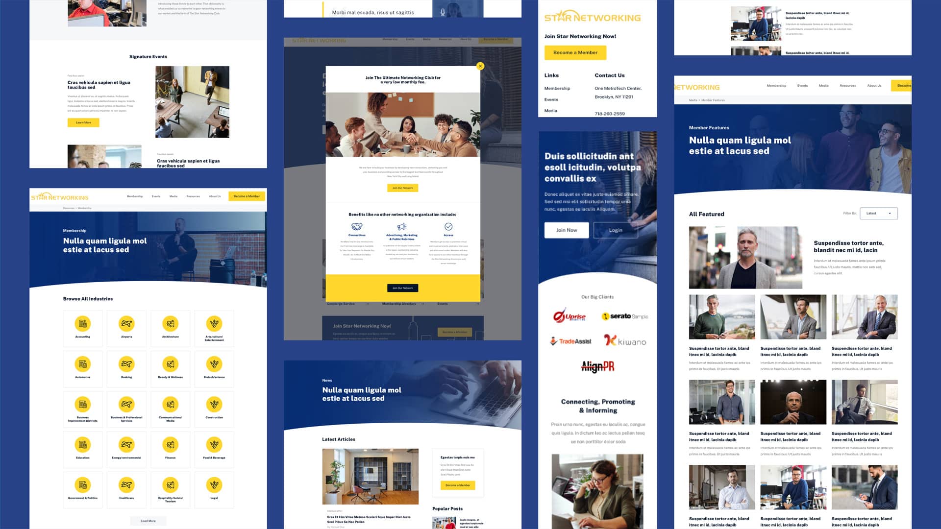
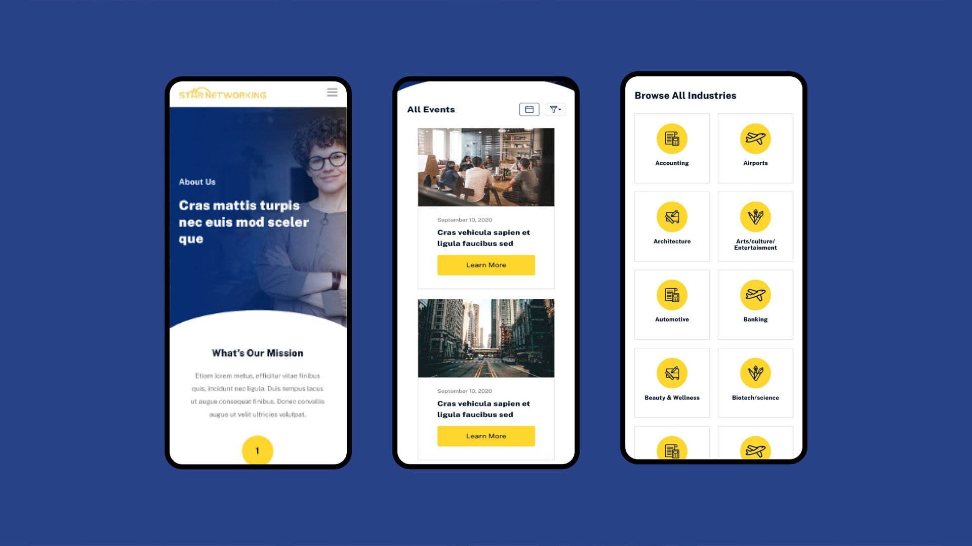
Schneps engaged Chillybin to redesign three properties: Brooklyn Paper, New York Family and Star Network, its business networking club. Each needed around 15 layouts, consistent across desktop and mobile, serving the reader scrolling the news and the advertiser paying for the space around it.

How we tackled it
One design language, fifteen layouts per masthead
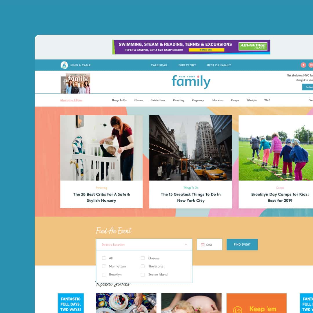
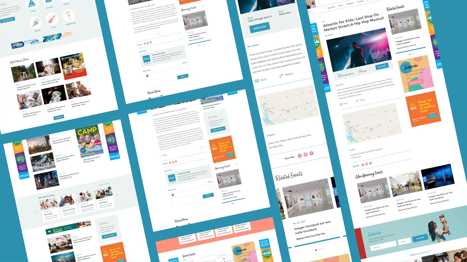
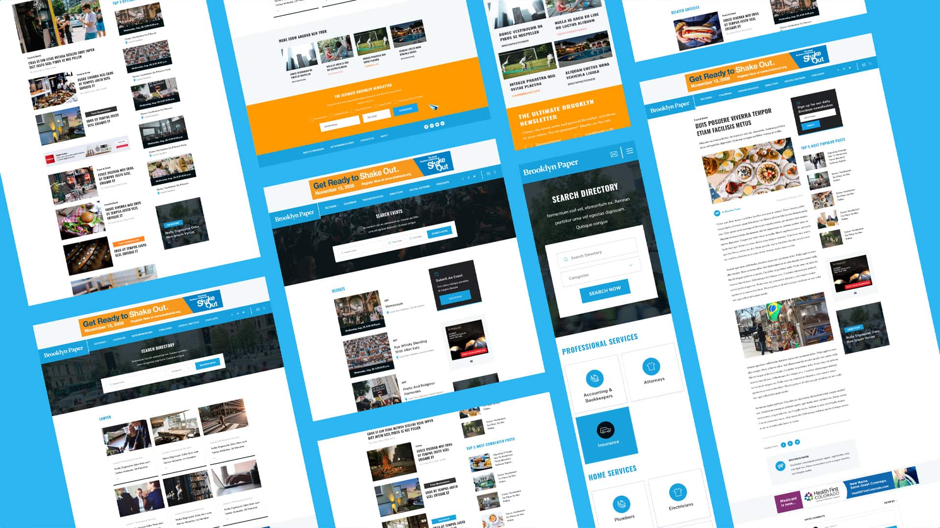
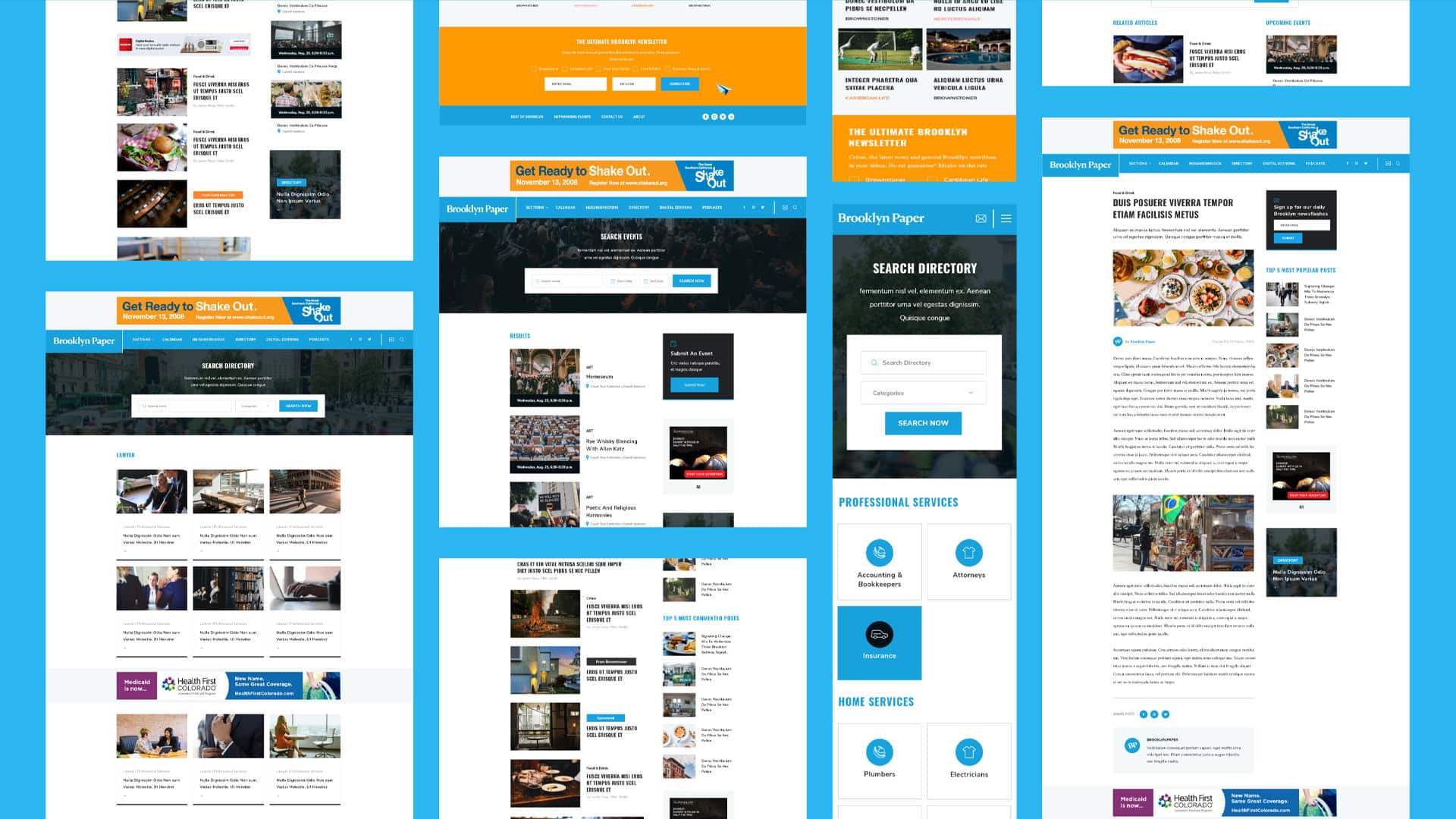
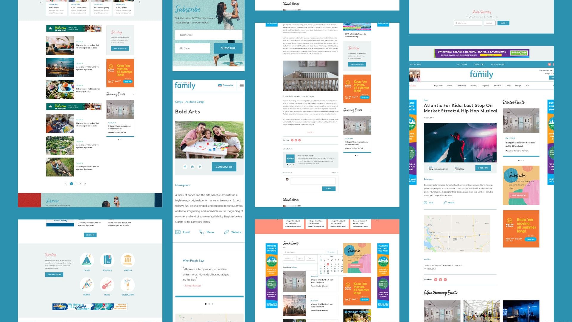
A publisher network lives or dies on consistency. Rather than treat each site as a one-off, we designed a shared system of layouts (homepages, article pages, section fronts, calendars, directories, mega menus) and applied it across the three properties, adjusting for each brand's personality. Brooklyn Paper kept its tabloid energy with three pinned stories over a chronological feed, in the mould of Curbed and Gothamist. New York Family got the warmer treatment its parenting audience expects. Mega menus surface articles dynamically, so navigation sells the journalism instead of hiding it. That matched how Schneps runs its platform: one parent WordPress theme, a child theme per masthead.
Design around the revenue, not against it
News sites that treat advertising as an afterthought end up retrofitting ad units into layouts that fight them. Schneps needed full-width takeovers at the top of the page, leaderboards, and wallpaper units that stay fixed while the reader scrolls. We designed those positions into the grid as first-class elements, to the client's ad-ops spec, so editorial and advertising could coexist without clutter.
The redesigned email signup asks for an address and a zip code, then offers newsletters from sister titles, turning one masthead's reader into a network subscriber.
Different property, different job
Star Network isn't a news site, it's a membership business, so it got membership design: member profiles, streamlined login and signup, an events calendar, podcasts and a concierge service. New York Family leaned on searchable directories (camps, schools, activities) alongside its calendar. The discipline was knowing what to share across the network and what each property needed for itself.

What we delivered
Schneps Media now has a coherent reader experience across its properties and a set of layout patterns that scale. Event calendars became usable, directories became searchable, and mobile stopped being the poor cousin of print.
The clearest signal is longevity. Six years on, Brooklyn Paper and New York Family still publish daily on the Chillybin design, and the shared-theme architecture now underpins the flagship dailies amNY and QNS as well. For a publisher that measures everything in page views and ad impressions, that is its own verdict.
What we learned
Publishers are the hardest UX brief there is, because every layout serves two masters. Delight readers but starve ad inventory and the client loses money. Maximise inventory but choke the content and the audience leaves. Designing the ad positions into the grid from the first wireframe keeps both honest.
Networks beat one-offs. Fifteen layouts sounds like a lot until you realise they're one system worn three ways. Doing the structural thinking once, then flexing it per brand, made the engagement affordable and let the pattern spread to properties we never touched.