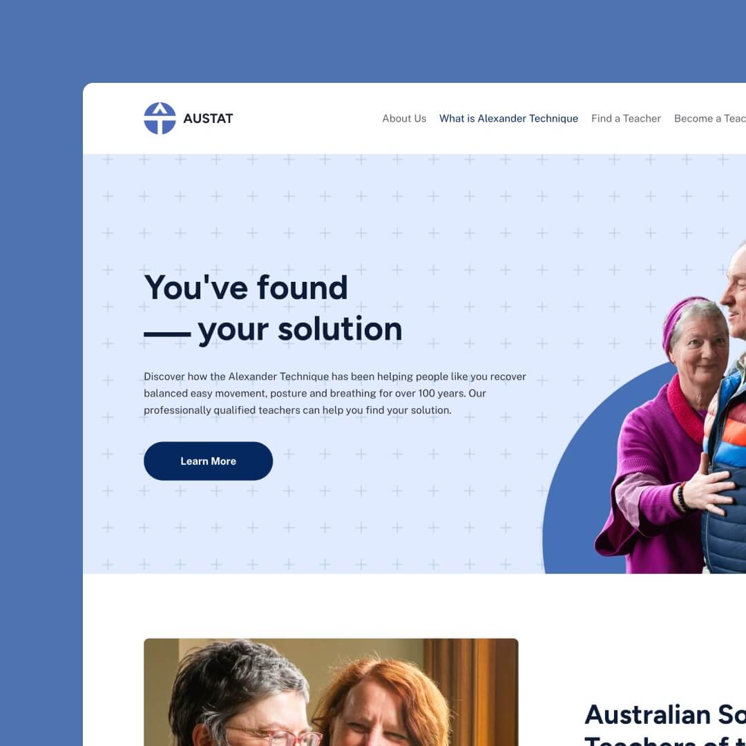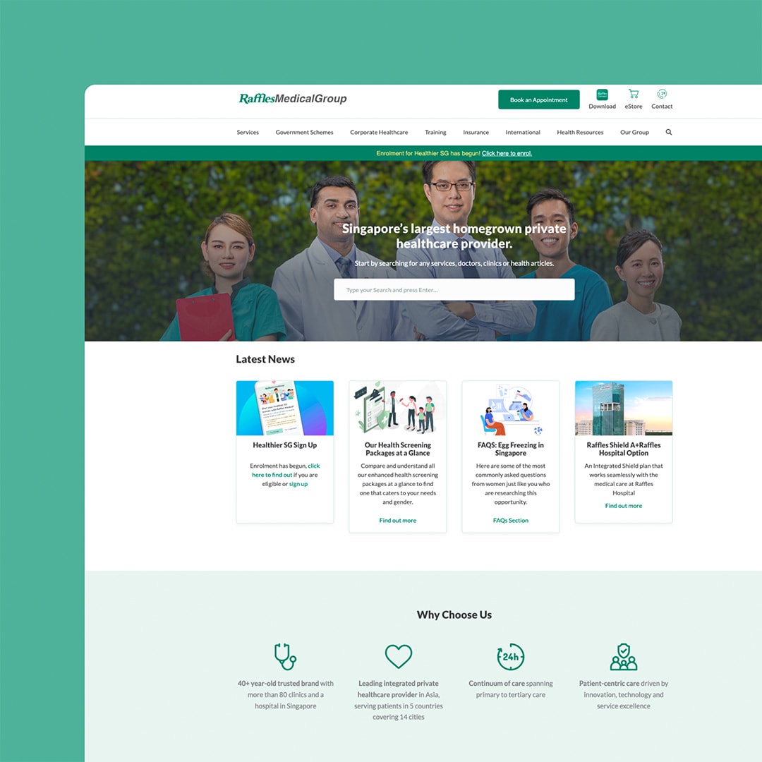
A common mistake business owners make with their online presence is trying to cover too many options. There is a desire to provide “something for everyone”, which only makes your website confusing, cluttered and uninviting.
The reality is that your business and your offer aren’t for everyone. There will be a predictable and targeted audience to who your business is ideally suited because you solve a problem they are currently facing.
While it can seem like a good idea to have as many options as possible on your website, rather than attract, you will most likely drive them away. There are a few goals a clean and clear website message can achieve, including:
- Reducing bounce rates
- Giving your visitors a straightforward journey towards a conversion
- Having your visitors stay on your site and browse longer
- Encourage visitors to return to your site again
One of the significant areas you can clean up and declutter is your website navigation menu. How this is presented and what you have listed here can significantly impact your conversion rates. This works by helping your visitors take the next logical step in the buying sequence so they don’t need to wade through unwanted information to progress. It’s faster, easier and more likely to get results.
Clutter can quickly put visitors off, be confusing or cause readers to feel overwhelmed and indecisive.
This blog provides some structured steps to simplify your navigation menu to take the overwhelm off your visitor’s shoulders and give them fast and convenient pathways to reach their goal (which should ultimately be the same as your business goals).
Key Takeaways
You can enhance user experience, improve conversion rates, and guide visitors toward their goals more effectively; you need to:
- Avoid Overcrowding and Confusion: Trying to offer something for everyone on your website can lead to clutter and confusion, deterring visitors and decreasing engagement.
- Targeted Audience Focus: Recognise that your business and offerings are not meant for everyone; instead, focus on a specific audience that your solutions can effectively address.
- Benefits of a Clean Website: Streamlining your website’s message and navigation can reduce bounce rates, guide visitors towards conversions, prolong browsing sessions, and encourage repeat visits.
Steps to Declutter Your Website Menu
Simple navigation is sure to give your business website an elegant and beautiful design. It combines the impactful elements of being highly interactive and minimal in one straightforward navigational pathway. When done well, you can continue this consistently throughout your website to get a beautiful website from start to finish.
These straightforward and simple changes will immediately impact your business website’s usability.
Here are six simple steps to take to move from a navigation that is cluttered and confusing to simple and elegant:
Only Assign Important Links
The number one rule for simplifying your menu is how many options you have. Try to keep your navigation limited to only the essential links.
Examples of your high-priority essentials are:
- Services/Products
- About
- Blog
- Contact
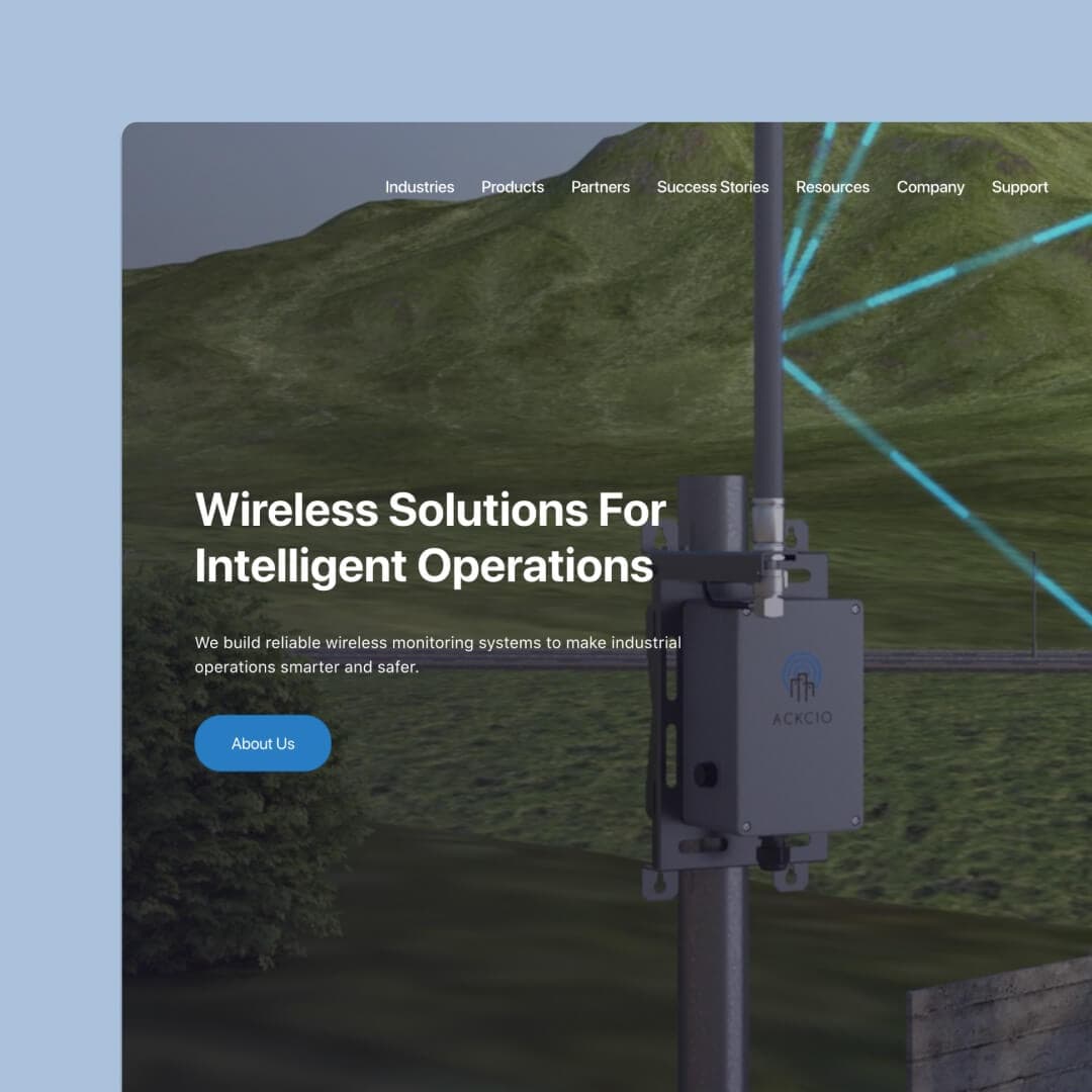
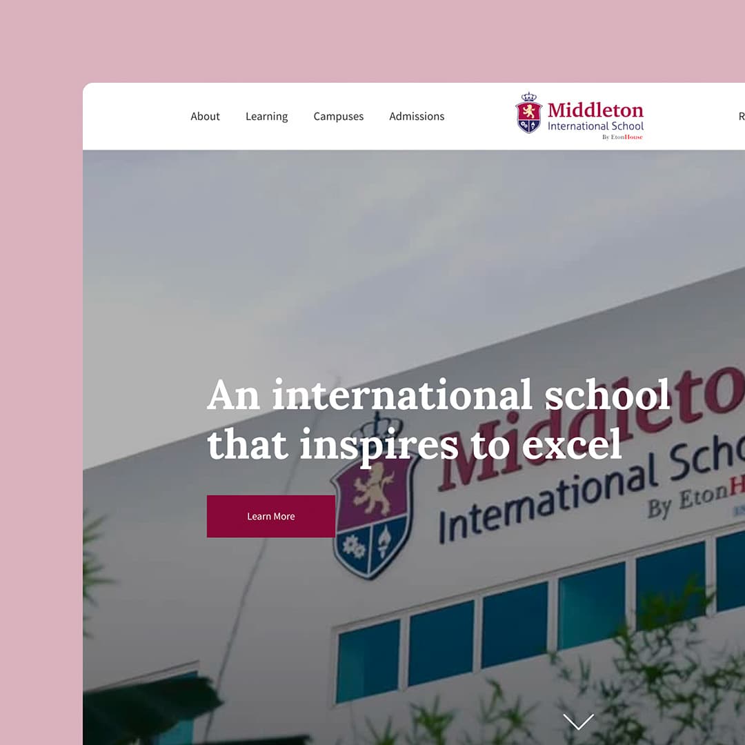
You want a minimum of three and a maximum of seven to hit that sweet spot of being informative enough without overwhelming.
(Note that the number of essential links doesn’t include secondary navigation drop-down or mega menus – we’ll cover these in the following points).
Keep the Navigation in View
While it might be tempting to hide your navigation, don’t. When it comes to a business website, practicality will trump style every time, so keep it in an easy-to-find and accessible spot, even across mobile devices, where you might be more tempted to reduce clutter by tucking it away.
Why? Hidden menus make more work for your prospects.
If you hide your navigation, make sure it’s behind the regular hamburger menu so it is easy to recognise. Remember, there are pros and cons to leaving your navigation open and tucking it behind an easily recognised button. Just be sure you choose the one that best suits your audience and screen size.
Open navigation menu – Open navigation links on tablet and mobile views provide a more intuitive user experience. Still, they can take up valuable screen space that confuses and clutters the smaller devices.
Hidden navigation menu – This can tidy up the message and content on a smaller screen and provide a streamlined look but adds an extra level of complexity that may be confusing, untrustworthy or hard to follow.
The worst you can do here is hide navigation links behind an icon or button. If you use a button as your navigation link, keep it labelled and always visible.
Assign Secondary Links
If you initially had any secondary links located on your navigation, move these out and let your essential ones shine. If the secondary links are helpful and needed by some users, slip them into a drop-down menu (with examples if this helps define them) or place them in your website footer. You can also do both the drop-down and footer options if you want to make these points accessible from several different locations.
We build stunning, user-focused websites that will wow your customers.
Are you a business owner in Singapore, Australia or worldwide? We work with clients across the globe to deliver beautiful yet functional website designs.
Steer Clear of Mega Menus
Mega menus get their name because they encompass everything – menus that open into multiple categories that branch into even more subcategories. While they can be a great way to show users every option available, is that something that is needed or beneficial to them?
Remember that your user has come to your site for one specific purpose. Make sure you understand this purpose clearly and create a website navigation and content pathway that gives them shortcuts to get precisely there.
Consider a section in the footer at the bottom of your page if you want to include some mega menu details.
Adapted to Every Screen
Controlling variable screen sizes is relevant no matter what changes you are making or what aspect of your website you are rejigging. I can’t stress enough how important it is to have a website that is optimised across all devices and screen sizes.
There are essential differences you need to consider from a desktop with oodles of room for content and navigation menus to tablets, smartphones and even wearables if you send out emails with embedded content and links.
Keep in mind, too, that desktop screens not only have more room for open menus, but these users have more time to browse. At the same time, mobile devices will probably be handled by users who are on the go, have limited resources, and be surrounded by distractions. Please think about your user positions and plan your website content and layout to make things as easy and straightforward as possible for them.
Choose Fonts Wisely
Most navigation menus use a standard font. While it might be tempting to go for something fancy to stand out from the pack, there is a reason why the pack follows simple, straightforward fonts: they are easy to read, fast to follow and get positive results.
You need to aim for copywriting that is simple and easy to read. Don’t risk choosing something eligible or dramatic. Stick with basic fonts that align with your content font and be happy to be straightforward and easy to follow rather than decorative and eye-catching.

What Are the Benefits of Decluttering Your Website Menu?
The benefits of a simplified website menu make it worthwhile. It’s important to note that businesses gain as much from decluttering as the viewer.
Putting in the work to cut your navigation back will help you prioritise your website offering. It will naturally bring the rest of your website in line with a decluttered flow and easy-to-follow navigation.
Organised Content
While simplifying your website navigation isn’t a big job and won’t cost much time or money, our clients still see significant benefits from just a few minor tweaks. The biggest one is that clean navigation will positively impact how your website is organised.
Overall a clean navigation layout makes for a better prospect experience.
To gain the simplicity we mention in the steps above, you’ll probably find the need to merge some of your website sections and bring your content under a collection of main headings. Chances are the navigation restructure will also prompt a clean-up of your content and allow you to create a concise and clean set of main pages, making it easier for prospects to search and explore.
You can still choose your content preferences based on content or audience structure, depending on what your audience will find more predicate and user-friendly.
Content-Based – Pages are put into the order of what users are most likely looking for. The content-based structure is favoured across most business websites because they are logical and usually aligns with visitor aims and goals, making them easy to navigate and yield good conversions.
Audience-Based – While not as expected, this structure is effective for the right websites. Having several audience personas who come to your website to fulfil different needs is valuable. The audience-based structure divides your site into sections that each follow different pathways depending on their needs. This will allow multiple users to navigate to their unique goals. You must clarify which section is for which user with clear labels, headings and well-structured navigation showing the ultimate goal.
Better Communication
Decluttering means less is more. That will require you to carefully select what goes and what stays and for the information you keep to be as clear and motivating as possible.
Getting this right means outstanding communication that will read well and elevate user trust in your ability to make good on your promise. Why? – you can demonstrate that you know what you are talking about.
You will use bolder and more impactful communication styles when you simplify your navigation. So, for example, a decluttered website menu label will feature only one word per section. For the most significant impact, choose your words wisely.
Higher Engagement
Simple navigation will encourage users to explore your site and take the stepping stones you provide through primary and secondary action steps. They will find it enjoyable to read, easy to navigate and offer precisely what they came searching for in the first place.
If you are seeing a high bounce rate, simplifying and decluttering your navigation menu is the first thing I urge you to look at changing. As well as, providing a straightforward and engaging navigation pathway will encourage you to get rid of excess content and surplus headings you have lying around within your pages. Once the navigation menu is cut down, it gives you a clear map of how the rest of your website content can look so you are not overwhelmed with where to start with a content overhaul.
If you are still stuck or seeing issues with your click-through rates or conversions, contact us for help and advice on how you can make some simple and consequential changes to your online business.
