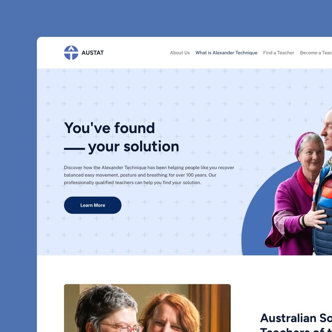
Your website is not just an online address; you must look like a modern company. It’s your brand. This is where people get to know you and see if they like you. Your reputation is at stake, as well as your business legitimacy. Your homepage needs to be engaging, even if it’s simple.
Table of Contents
Why an impressive homepage is essential
First impressions stick in people’s minds and colour everything they experience afterwards. Studies show that first impressions are formed in 5 to 7 seconds, and online is no different.
You have just five seconds from that first link click to capture your visitor’s attention, which means what you offer needs to be clear, friendly, relevant to your business and speak to your customer on their level.
A business selling grand pianos would have a different look and tone than one selling car parts or baby food.
One of the big mistakes people make on their homepage is they fail to clarify what they do! If you’re not clear, why should people stick around and try to work it out?
Here are some big things to avoid if you want those first five seconds to be engaging:
- Mess. This can come from too much colour, too many images or poor formatting or font choices.
- Confusion. This comes from too much text, too many links, conflicting information or irrelevant images.
- Adopting an overly formal tone. Flowery language, outdated speech or elaborate language misses the mark when it comes to having your visitors feel safe, connected and on the same page.
Here are some homepage structures that give visitors a positive first experience.
Bold headline
Start with a big, bold header that captures what you do in a few words, or at best, a sentence or two.
This should answer your visitors’ basic questions and guide them to other pages for additional details.
With your headline choice, be clear and keep it simple. You want your visitors to know your website’s offers in only a few seconds.
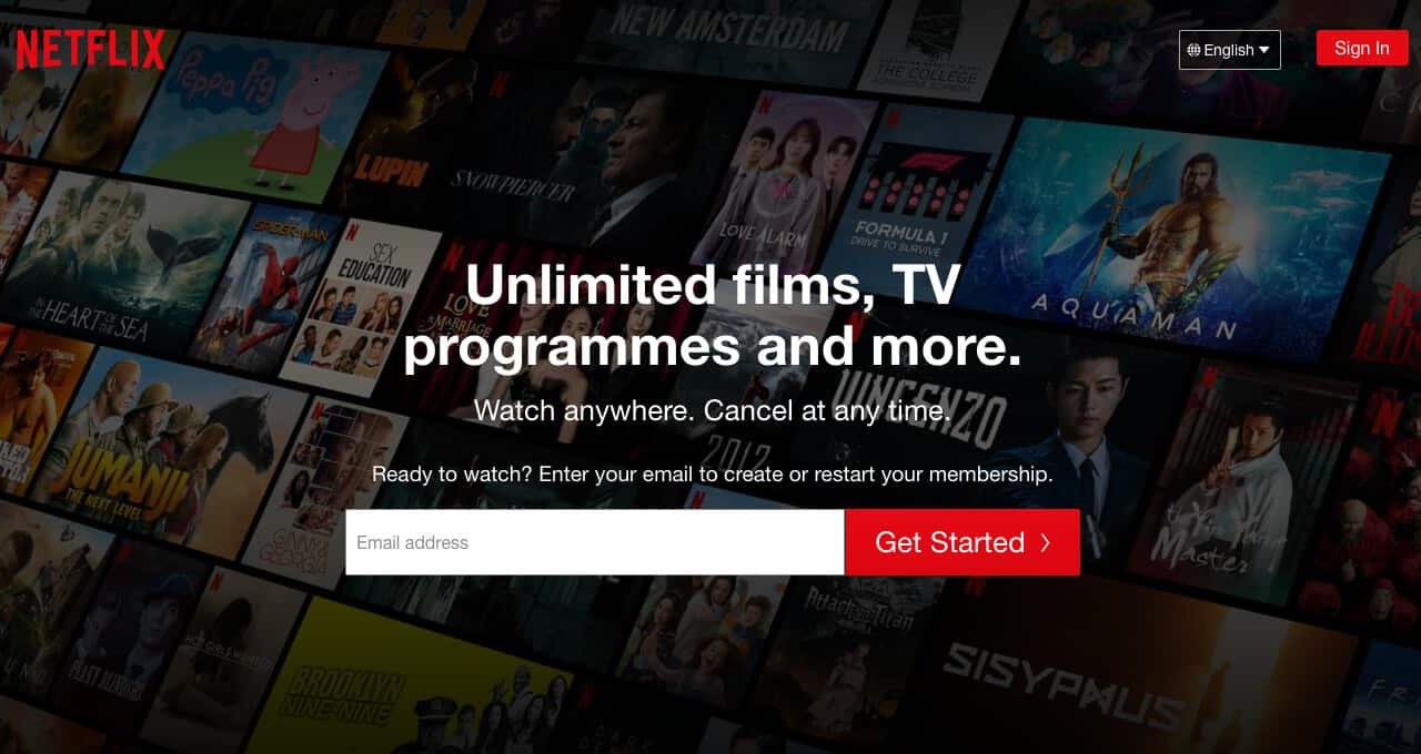
Here are some examples of homepages that are simple and effective:
Netflix: Unlimited movies, TV programmes and more. Watch anywhere. Cancel at any time.
Apple: Displays their most current product by name, tagline, price and stunning image. e.g. iPhone 12. Blast fast past from $1,199 before trade-in.
Products: A Featured Posts Scroller might work for you if you offer several products on your website. It enables you to showcase a handful of products but spaces them out so only one is visible at a time. This cuts back on mess and confusion while allowing you to open your focus to more than one item.
Easy Navigation
The proven rule for effective website engagement is three clicks (or less) from the homepage to the sale, which will be your product page or services page.
Some companies handle all sales personally, directing people to contact information or an online form.
Whatever it is for your business, you want to ensure your visitor can meet their needs quickly and efficiently.
Any help you can provide regarding Buy Now buttons, links to product pages or easy-to-see menus will help keep your user engagement high and have visitors stay on your page for longer.

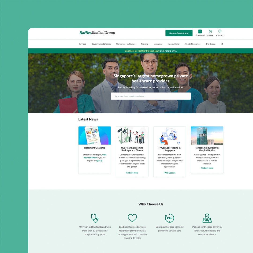
Check out this example: Raffles Medical Group
They have ‘book an appointment’ in green at the top and an extensive search bar in the middle, making it simple for visitors to act.
If we continue with the example of Apple’s website, their home page showcases each of their most current products and provides a direct button linking to this product there and then.
It makes their top-selling products their focus, with all other products easy to find through the dedicated pages listed at the top of the homepage. Simple, straightforward, direct and empowering for the user.
We build stunning, user-focused websites that will wow your customers.
Are you a business owner in Singapore, Australia or worldwide? We work with clients across the globe to deliver beautiful yet functional website designs.

Design
A good, clean design eliminates those trouble spots of mess and confusion.
White space is crucial to a good homepage design and a clean look.
You want your layout to have balance and align with your brand’s look and feel.
Include your logo (unaltered or specifically designed for web use) and stick to a colour theme to tie it all together. Consistency is vital here, so find a layout and theme that works and stick to it.
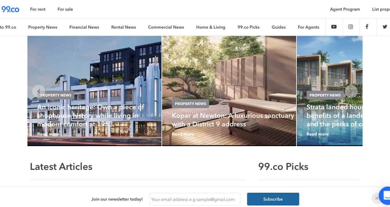
Check out this example: 99.co
They utilise all these great design strategies for a clean, professional impression.
The design also includes readability. Ensure your text is in high contrast with the background and is easy to read, even at a glance.
Call To Action
A Call to Action (CTA) is a great way to engage with your visitor and get them started on their journey with you. It requires your visitor to complete a specific task. A CTA works best when there is a gain for the user and little or no risk or commitment.
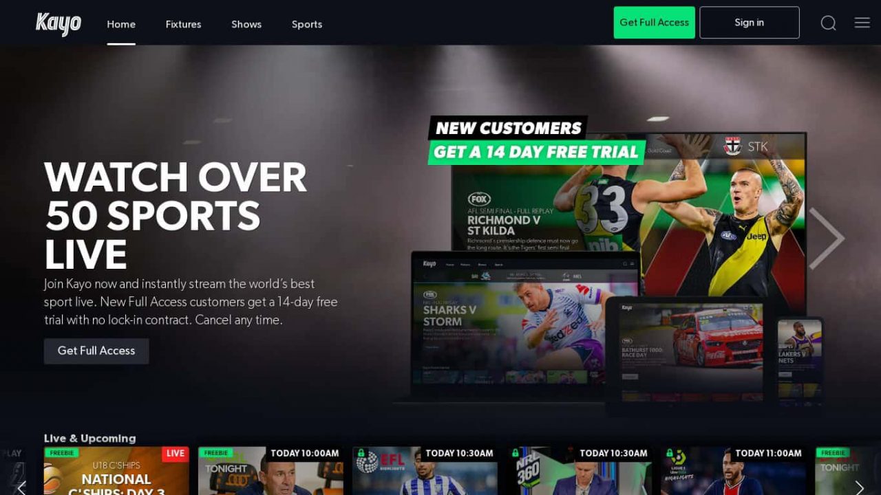
Check out this example: Kayo
They offer a 14-day free trial. It shows how many live sports they have, plus it’s easy to see the sports available.
Some well-used Call to Action (CTAs) are:
- Free trial periods
- Buttons for Buy Now or Sign Up Now
- Money-back guarantee
- Bonus offers for immediate purchase (such as discount or upgrade)
- Subscriptions
- Contact us
Remember, a call to action can sometimes be non-purchase related, such as simply making an appointment for a future service.
Look to place your CTA in an easy-to-see yet logical location, and it might feel too aggressive to have a CTA upfront; give them a moment to see who you are before you make an offer for them to take action. Under the headline is a great place to start.
Be attractive. You need your CTA to look appealing, so go for high visual appeal with colour, perhaps a button or image that fits well with your business’s offerings.
Some calls to action are wordier, which can work better as dedicated landing pages asking for a sign-up. Be brief and focus on the end goal for the user and what they get out of it. You want to entice your visitor to follow through, making it attractive and risk-free.
Traffic and Likes: A call to action can also be used as an effective blog engagement method to get more clicks on your website. In these CTAs, you can prompt people to leave a comment, click through to related articles, or sign up to your database for newsletter updates.
Cater to a wide range of senses
We use our senses to engage with our environment. It is no surprise that the senses come into play in the virtual world, too.
As well as providing information, you also want to provide images and sound, which can be achieved through photos, video, music or sound effects.
Videos are a fantastic engagement tool that lets your viewer get to know you, your business or your products in detail.
To be able to see you or your products in action is a personal and reassuring step.
For this to work you need to remain relevant to your brand. Choose images that directly relate to who you are and what you offer.
While it might be tempting to use generic images, it is always better to be upfront and honest with your visitor by showcasing your office, staff, products, and you.
This personal touch will have an incredibly positive effect, especially if they see you in person or visit your business site at a later date. This re-enforces trust, reliability and authenticity. You might also find it useful to stick to your brand’s colour theme to create a feeling of harmony from end to end.
Many stock photos of people have a cheesy, fake look that you want to avoid at all costs.
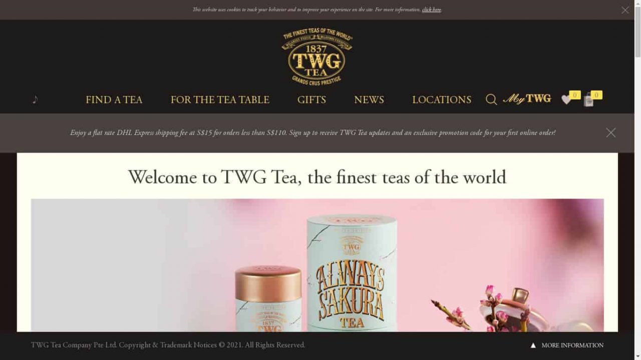
A great example of a powerful and emotion-inducing video is TWG Tea. The use of decoration, focus, narrative and music showcases the history of tea and their knowledge in creating it, leading to an experience people desire and enjoy.
They also make this more personal and intimate by using a video of Taha Bouqdib himself in a setting that looks like his office. We are invited into an intimate personal space and taken on a scenic journey that is vivid and inspiring.
TWG Tea also demonstrates a fantastic use of headlines, calls to action (a discount code for 15% off if you download their app) and visual appeal through colour and stunning teapot photos.
Solve problems and answer questions
Once you have introduced yourself captivatingly, it’s time to go into detail with your content text. This is where you answer any questions your visitor may have and demonstrate the solutions your product or service brings to their lives.
To do this well, you need to have a solid understanding of your visitors’ problems and challenges.
Your product or service itself will solve a problem, so outlining what you do and why you do it will not only cover the basics, it will also be relatable and engaging for your reader.
Be sure to use the correct language. Adopting the right tone will engage your reader.
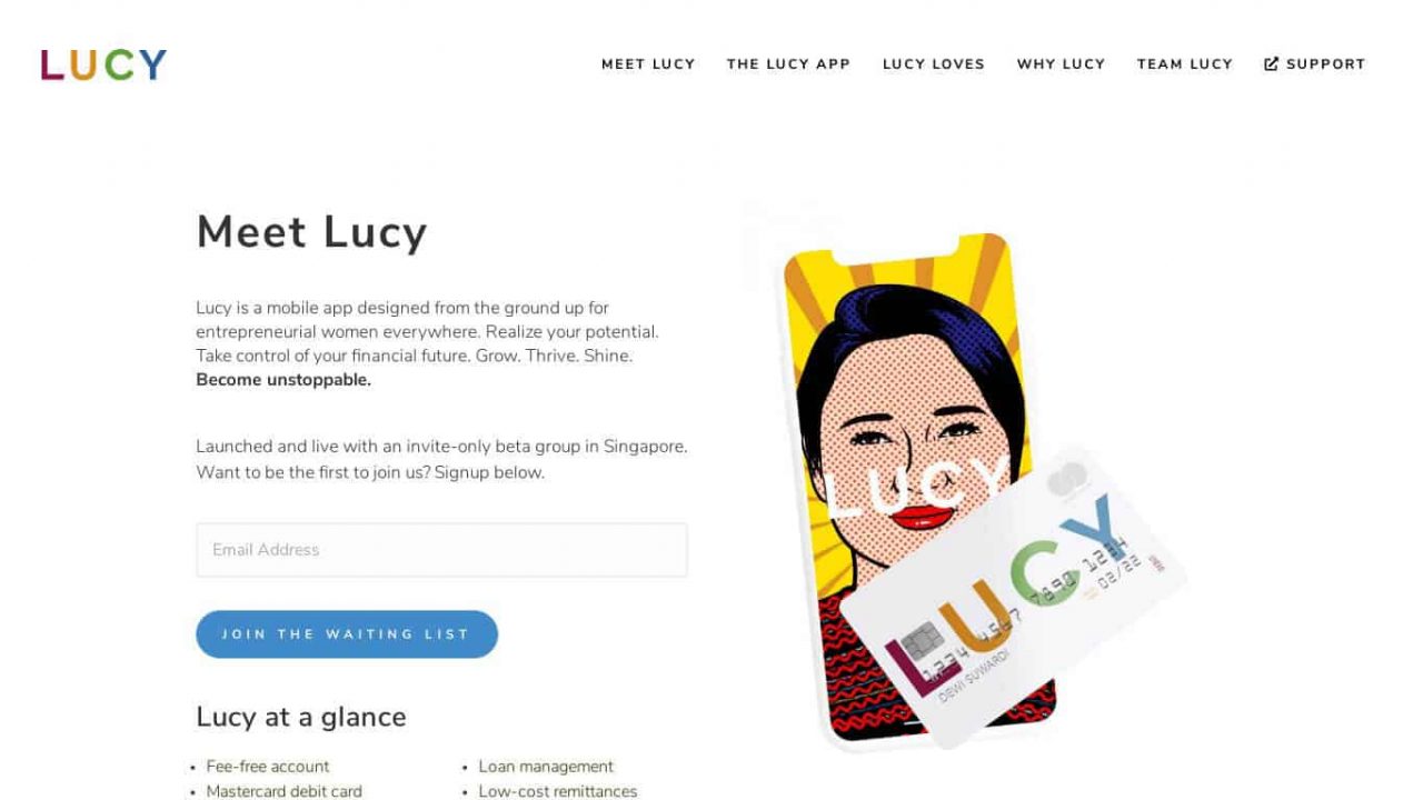
Check out this example: Lucy
They use language that is exactly right for their target market.
On your homepage, this can be as simple as listing the benefits and features of what you offer or providing a brief and clear example of the gap you meet.
SG Homemade website for baby food has excellent baby-themed graphics to illustrate the benefits of food powders: whets the appetite, nutrient boosters, easy consumption, and tackles selective eating.
This addresses caregivers’ fears and difficulties regarding feeding time and highlights the benefits. They follow with a second, simple graphic demonstrating natural ingredients: no salt, no MSG, no additives, and no preservatives.
This addresses the need for parents to provide healthy foods for their little ones and overcomes the problem of not having a market saturated with added ingredients for children.
They also use their signature red to reinforce the brand and select fun and likable graphics.
Reviews and testimonials
One element that is essential to building your website is trust.
Your visitor wants a safe investment of their time and money. They want proof your system, product or service will be worthwhile.
The most convincing way to achieve this is by providing living proof. Customer reviews and testimonials are real people giving their honest feedback on their experience with you.
To make this credible, include names, locations and dates (with their permission).
E.g. “I saw results in only five days!” Tiffany from Orchard, Jan 2021
Video testimonials or photos greatly increase engagement and credibility and provide a relatable and personal touch.
For this to be powerful, it needs to be about your current business and services, so keep it up to date and ask happy customers if they would like to supply a testimonial to post on your website.
Also, watch for the positive feedback you receive and ask if you can make this public. A satisfied customer is usually happy to help you promote your business.
Business milestones
This one is similar to social proof, and this is business proof.
If you have won awards (or even been nominated for an award or received recognition somehow), display it on your home page.
Any third-party acknowledgment that speaks highly of your business proves that you are a trusted brand in your industry.
Other business milestones can include
- Long service or running time
- The high volume of products sold
- Business expertise
- Business partnerships or affiliates of notable brand
Highlight any accomplishment that sets you apart from your competitors. This provides a first impression of reliability and trust and gives you concrete credibility.
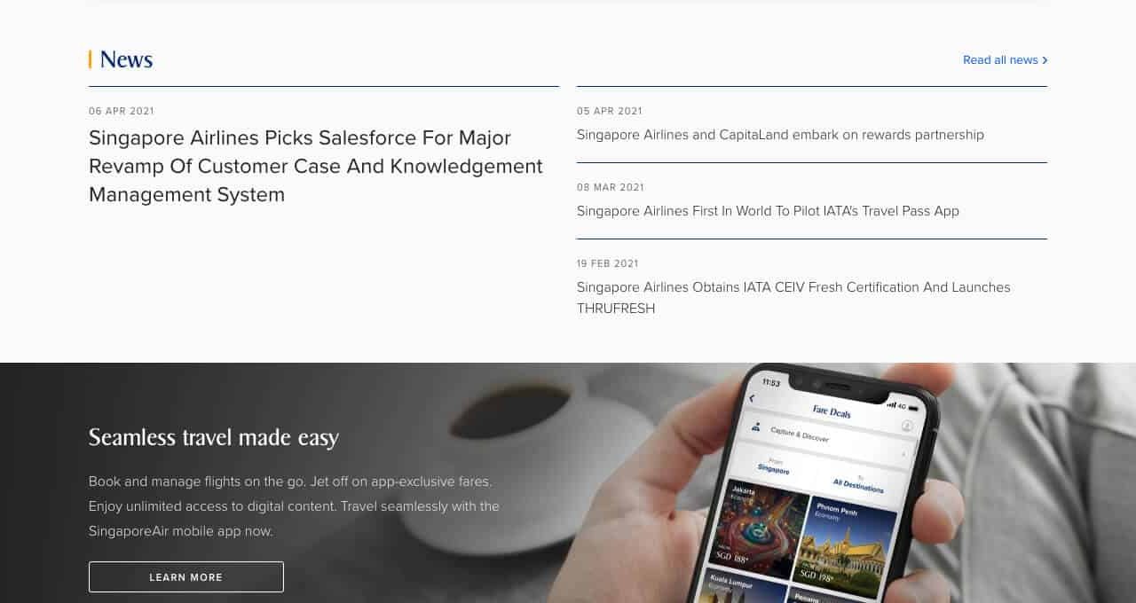
Singapore Airlines offers a ‘News’ section on its homepage (a format that adds further credibility) and lists headline articles that are always positive, highlighting new technology or business success.
These are presented in date order and are always current. Visitors can click on the article to read it for more details.
9. Loading Time
You only have five seconds to make that fantastic first impression. If it takes ten seconds for your page to load, you’ve lost your visitors’ interest.
Ideally, your page should load in two seconds, which gives your viewers three seconds to glance over your headline and images and decide if they like you.
While you can’t control the internet speed or connection at the user’s end, you can do a few things to help reduce loading times and speed up your engagement.
- Make sure you have a quality web host with a strong network.
- Have a minimal number of plugins
- Optimise the size of your images and videos
- Reduce your CSS files and JavaScript
Don’t be fooled by what your computer is displaying. You will be seeing a cache that remembers the data from previous viewings. To truly know how fast your website loads, ask a friend to load your site and see how their computer handles the downloads. You can also clear your cache to get a clear view.
If you’re interested in getting more granular detail, GT Metrix will analyse your site in real time, grade it, and show you where you can improve.
Test it now that you know all the necessary elements for fantastic engagement. Get feedback from friends and potential customers about your website’s look, feel and handling and make adjustments accordingly.
If you need help updating your homepage, Chillybin is a freelance website developer who can help you plan a new site, re-design an existing site, or audit what you have and suggest the best steps forward. Contact us today, and let’s look at how we can make your homepage engage your visitors better than ever before!
Our expertise
Website Design
We mix creativity with UX thinking to design interfaces that feel seamless. Always responsive, always built around outcomes — leads, engagement, conversion.
